
GAMMA & Karwei App
A new mobile experience for handymen and decorators in the Netherlands and Belgium.
Fashion Designer Mevan Kaluarachchi has a website for many years. It changed multiple times to keep it up-to-date. By that time, I maintained his site based on a layout which was unreliable at the end. It kept crashing after updates or moderations. Because of this, I offered a proposal for a redesign. The new site had to be more reliable, with relevant links, clear navigation and clean looking. It also had to be more creatively appealing rather than the last layout.
I started my research in looking at the layout of his previous website designs. It was clear that images where always the focal point of the sites, which makes sense when showcasing clothing design. It still contained a lot of white space and a clean looking UI.

As white spaces and clean looking UI is also trending in most website designs, It wasn’t hard to find inspirational websites. They used images as focus points and colour as detail (except the Cerruti website). As the brief asked me to create a more creatively appealing website, I also thought about how to distinguish the MEVAN website from the inspirational ones.

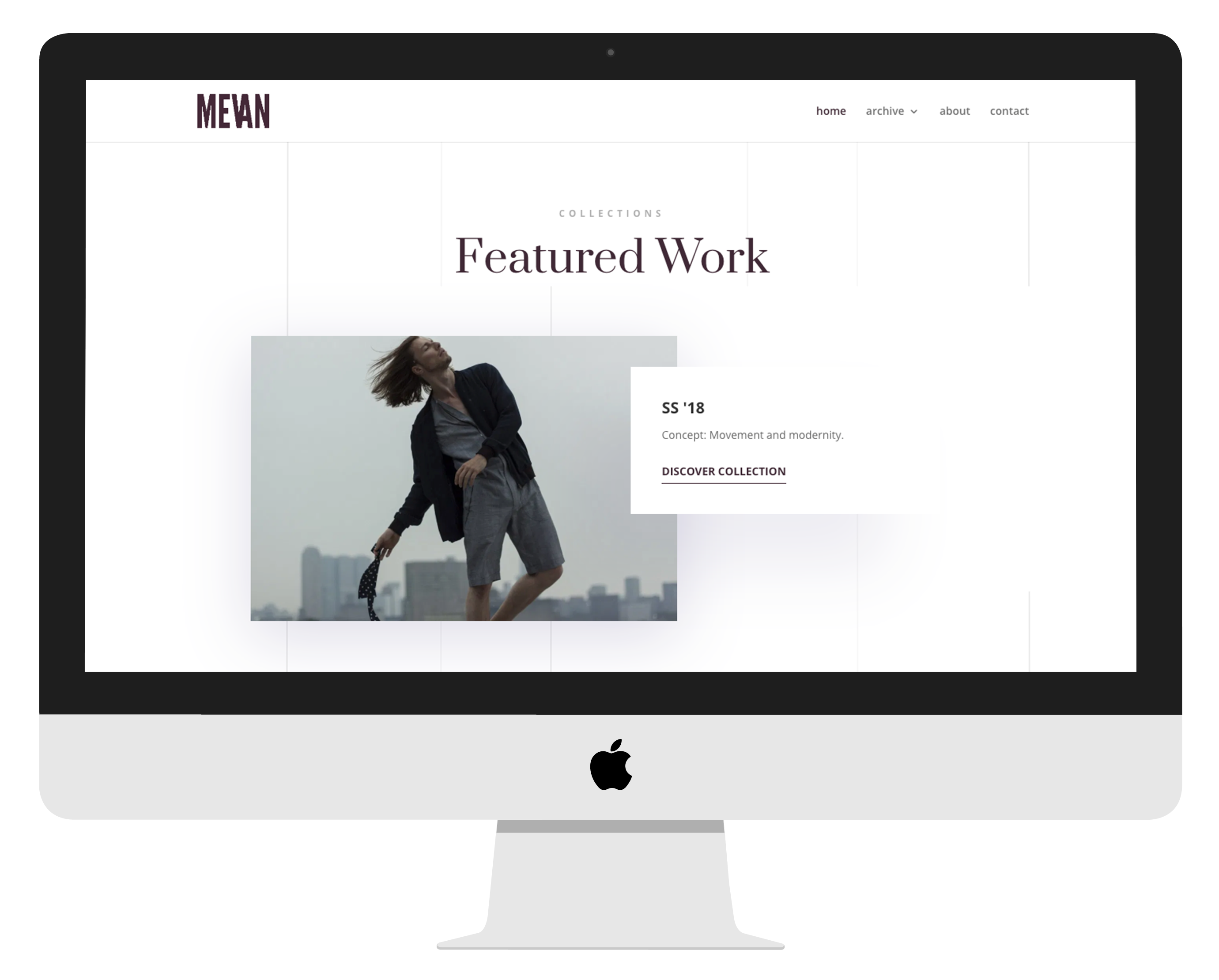
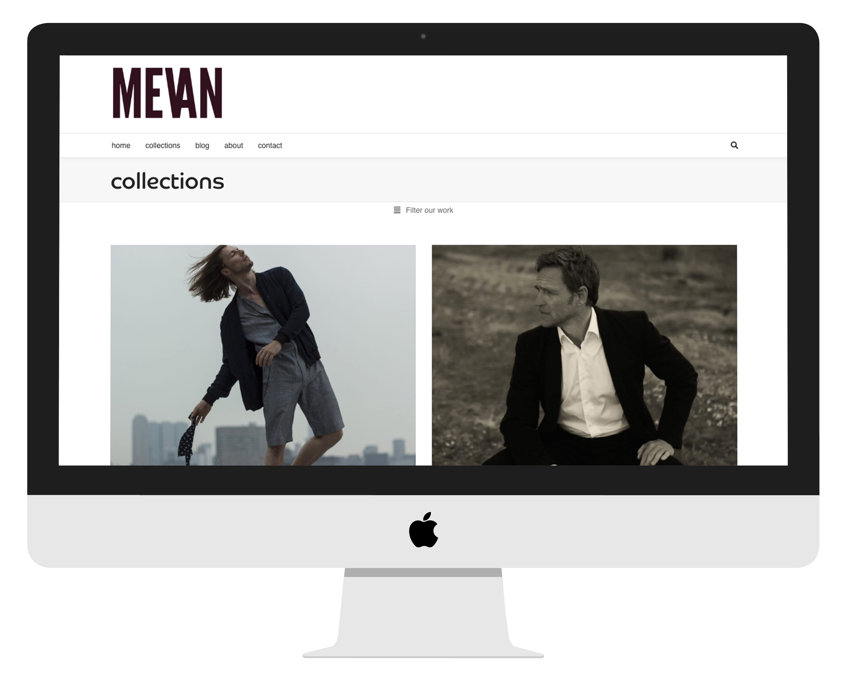
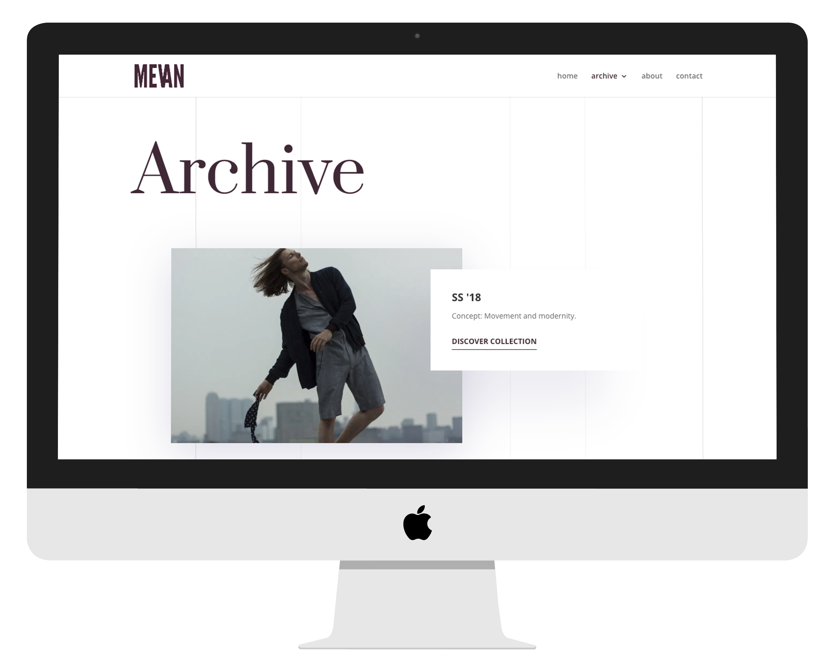
I haven't created lots of adjustments to the website structure other than removing the - mostly not correctly working - search option, a not-updated blog and an old showcase page. Although, by transforming the 'collections' page to an 'archive', I created the opportunity to do more with that page than showcasing past collections.

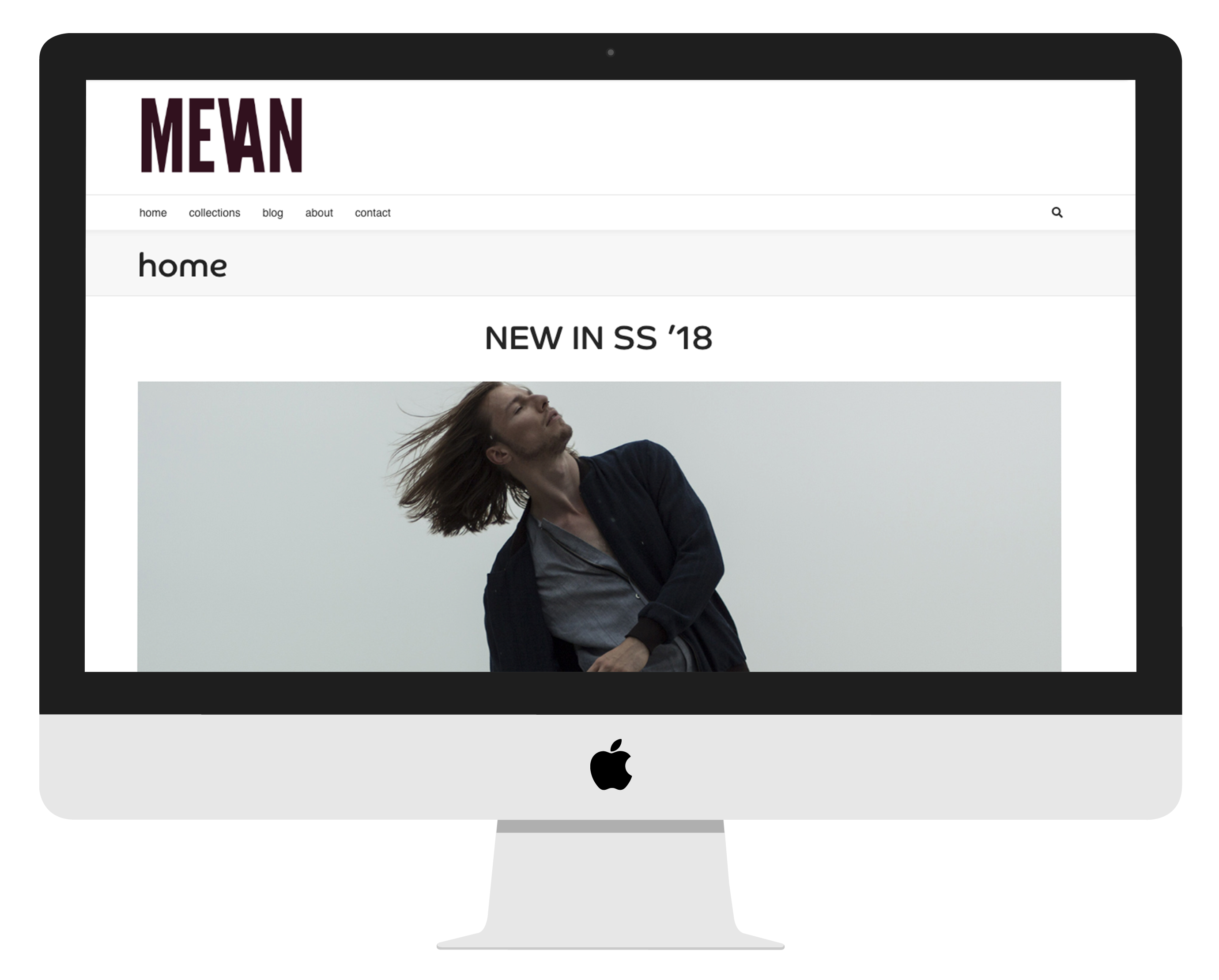
Research from past websites from MEVAN shows a small homepage with very few interaction possibilities. Therefore, the bounce rate was always quite high (~70%). I provided more triggering information and interaction possibilities on the homepage in my wireframe proposal. Also, I implemented a more artistic appeal as asked in the brief with a tasty variety between different sorts of media. The main call to action changed from viewing the latest collection to showing the archive. The wireframes also set the tone for the reinvented archive page.

The core identifications of the MEVAN brand are white, clean and with the focus on the image. Within his work, his strength is within the details. His previous website was not focused on those and so has this been improved in the redesign.

Within the new design, I tried to trigger the visitor more than before by posting multiple groups and other sorts of media such as images, videos and icons, together with information about the designer. The menu is now more inventive but mainly unchanged.
Redesign of the Homescreen

There was a page dedicated to previous collections. Nowadays, the designer would also like to show other work and media expressions. From now on, the page transformed into an archive. This archive allows all different sorts of media, such as individual assignments and videos.
Redesign van het archief
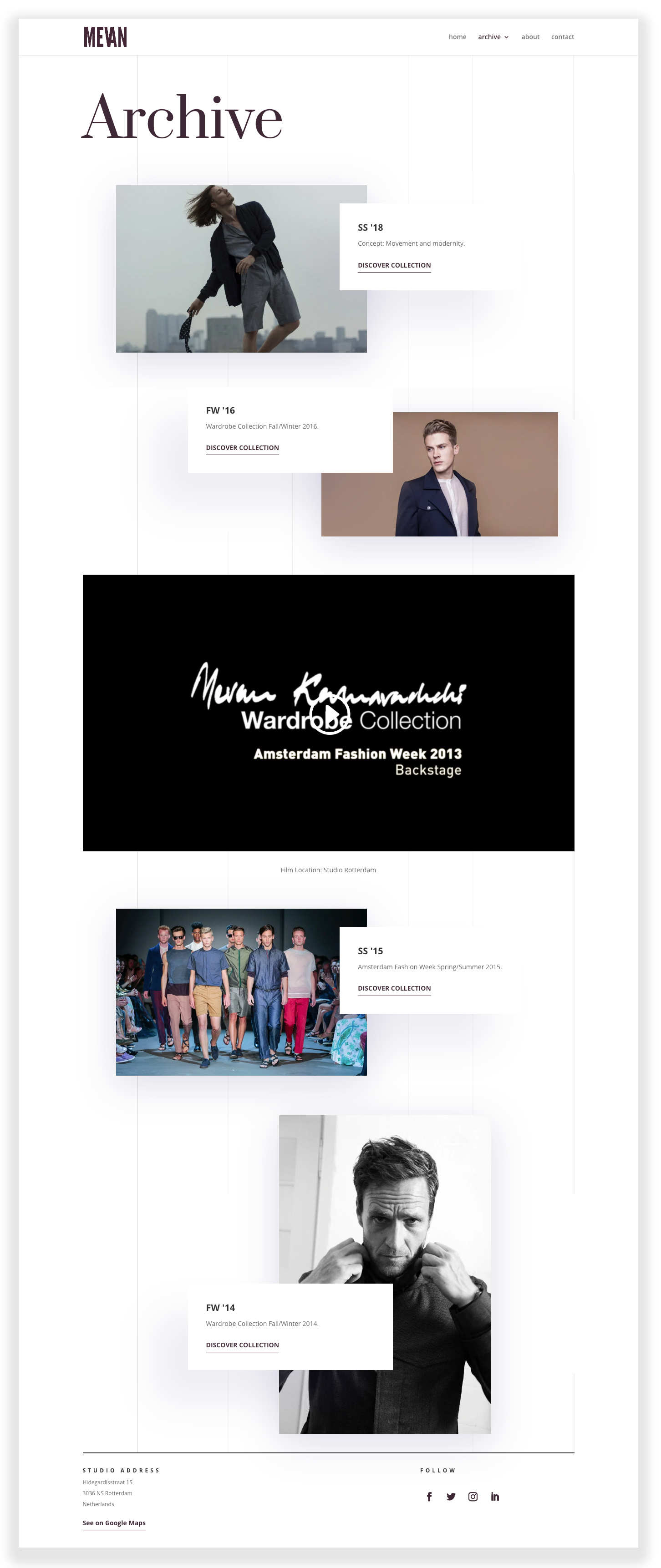
There is a lot of effort required to create a collection. In most times, the designer would like to tell a story and would try to communicate a certain feeling to it. The story wasn't delivering on his previous website. Now, there is plenty of space to add text, videos and other ways of providing the right feeling. Furthermore, the images are more structured and are better within their fullscreen settings.
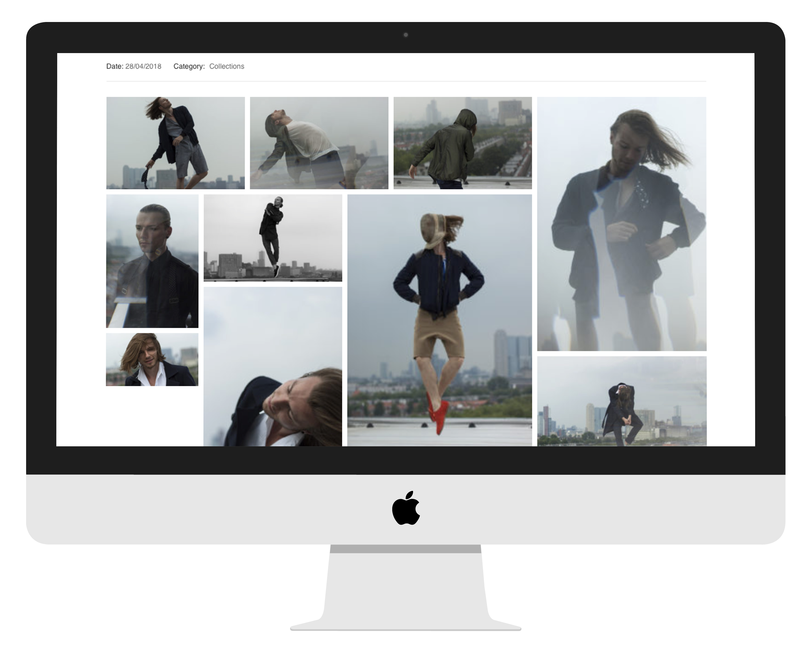
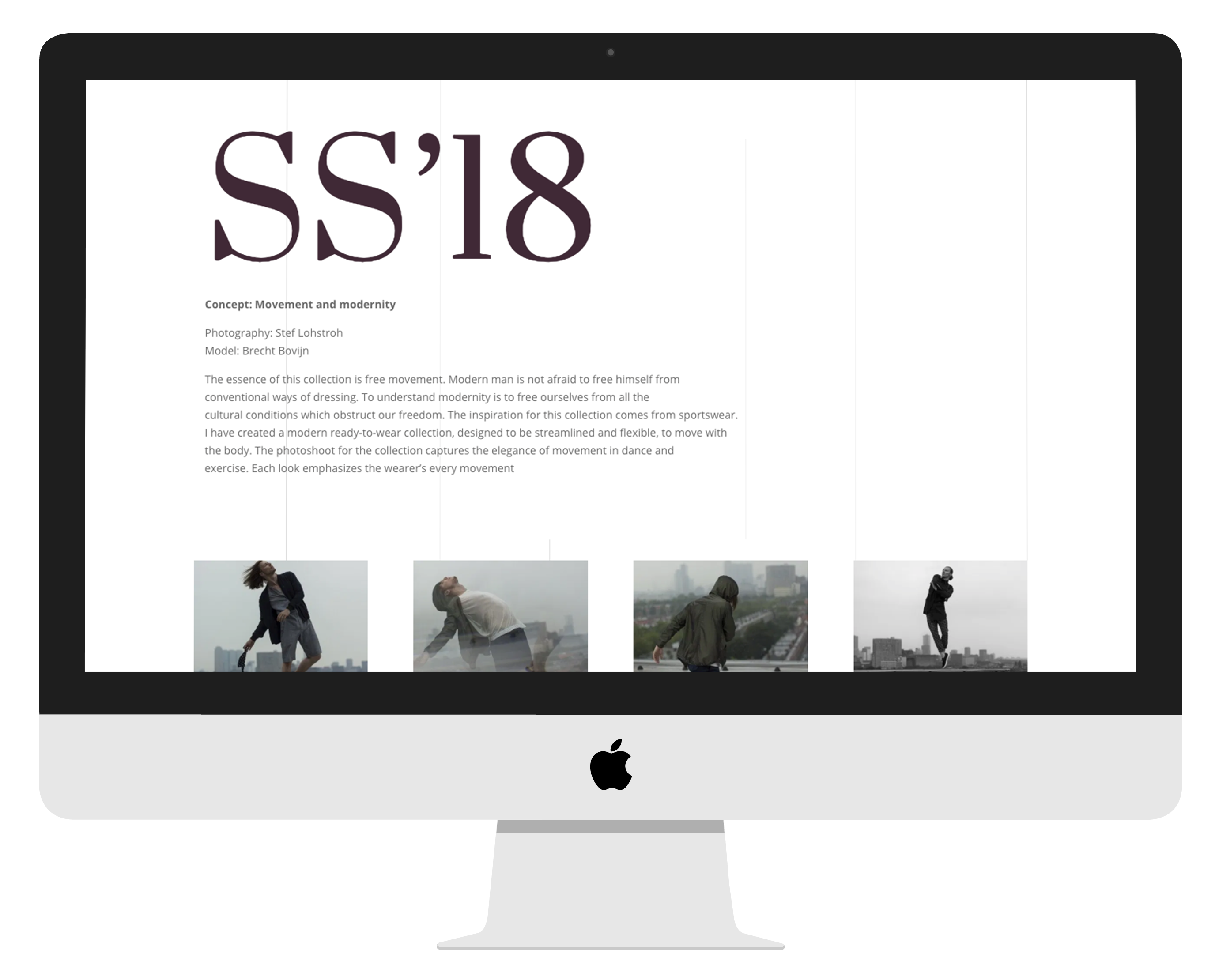
Redesign of the Collection Pages
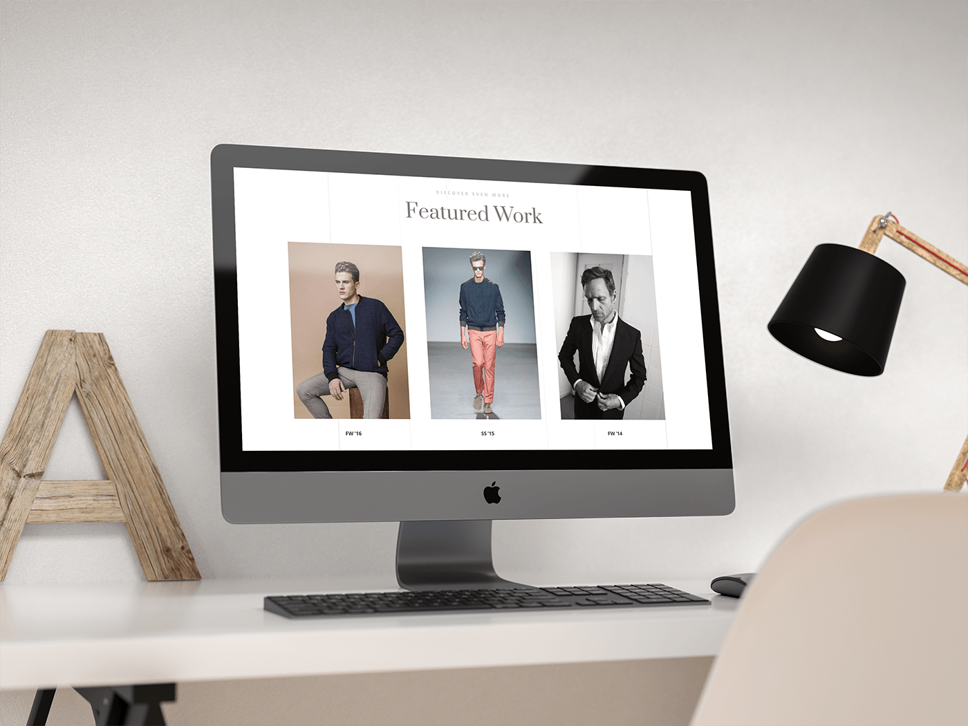
A lot of visitors will land on a collection page after references and search actions. It is essential to keep those visitors interested by showing other collections. From now on, every subpage like the collection page and about page does show featured work to keep visitors engaged.
The new website design, together with improved SEO, shows a clear difference within the statistics. The users are increased by 15.6% along with almost 20% increased sessions. Furthermore, the bounce rate went down to 59%, thanks to the more engaging homepage and the featured work section at the bottom of a collection page. The duration of which a user spends on the site is most impressive: This increased by more than 160%.
A new mobile experience for handymen and decorators in the Netherlands and Belgium.

Managing the internet network on a TV app.

An online learning environment to support practical education.